Kotobuki House Logo
December
When I started checking out website builders for the Peeling Paint blog, I was turned on to the idea of a logo. In the first steps of building the website I was prompted to add a logo, if I had one. But I didn’t have one. I had long had the blog’s name. Rust seeping out of the cracked white paint of railings, pipes, and stairs struck me visually. I thought it intensely tactile. Maybe even a bit olfactory. And it reminded me of a short story (by a friend, unpublished and likely unfinished) about Kofu. So I latched on to these words that are probably not helping me show up in Google searches. But I was never in doubt that peelingpaintkofu was the name.
Kotobuki House simply came from the address. The house is in that neighborhood. To distinguish the building from other properties I was looking at, we referred to it as Kotobuki House. We met with Iroha Craft to discuss renovations, and they wanted a project name - well, let’s just call it Kotobuki House. We needed to register and needed a name on the application - Kotobuki House.
So far, two pretty important decisions which, once made, you’re going to have to live with, and I didn’t really want to overthink them, or challenge them. So it was always likely that the process of choosing a logo would follow suit.
January through May
So January, February, and March went by without me thinking too much about it.
Then, in April, renovations started to wrap up. We’d visit Kotobuki House and walk through with Iroha Craft, checking off boxes. On one of those visits, Makoto from Beek Design came along to talk about signs and designs, including what I wanted for a logo. So I really needed to start considering it. I thought about some of the logos I had seen around town.
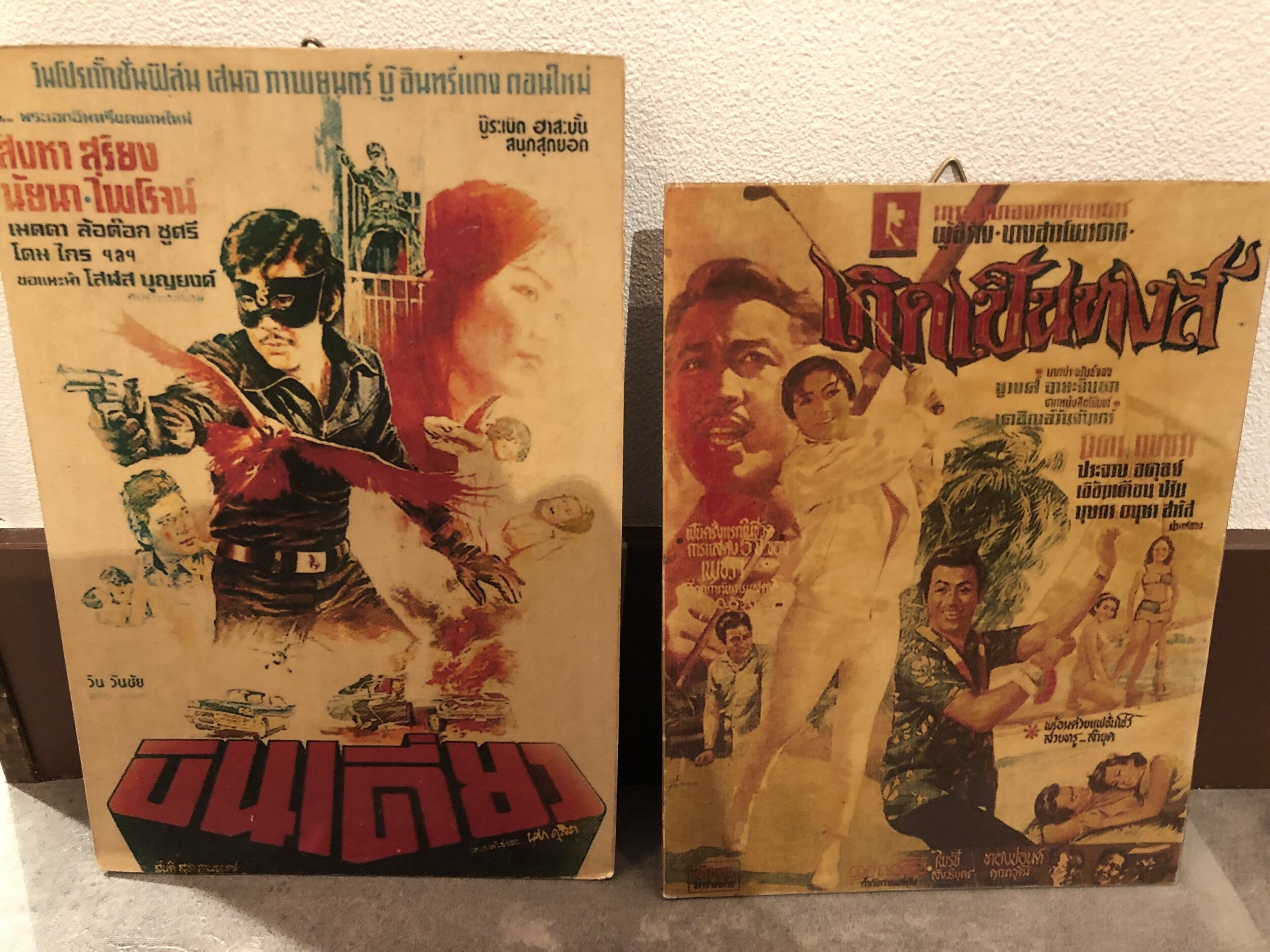
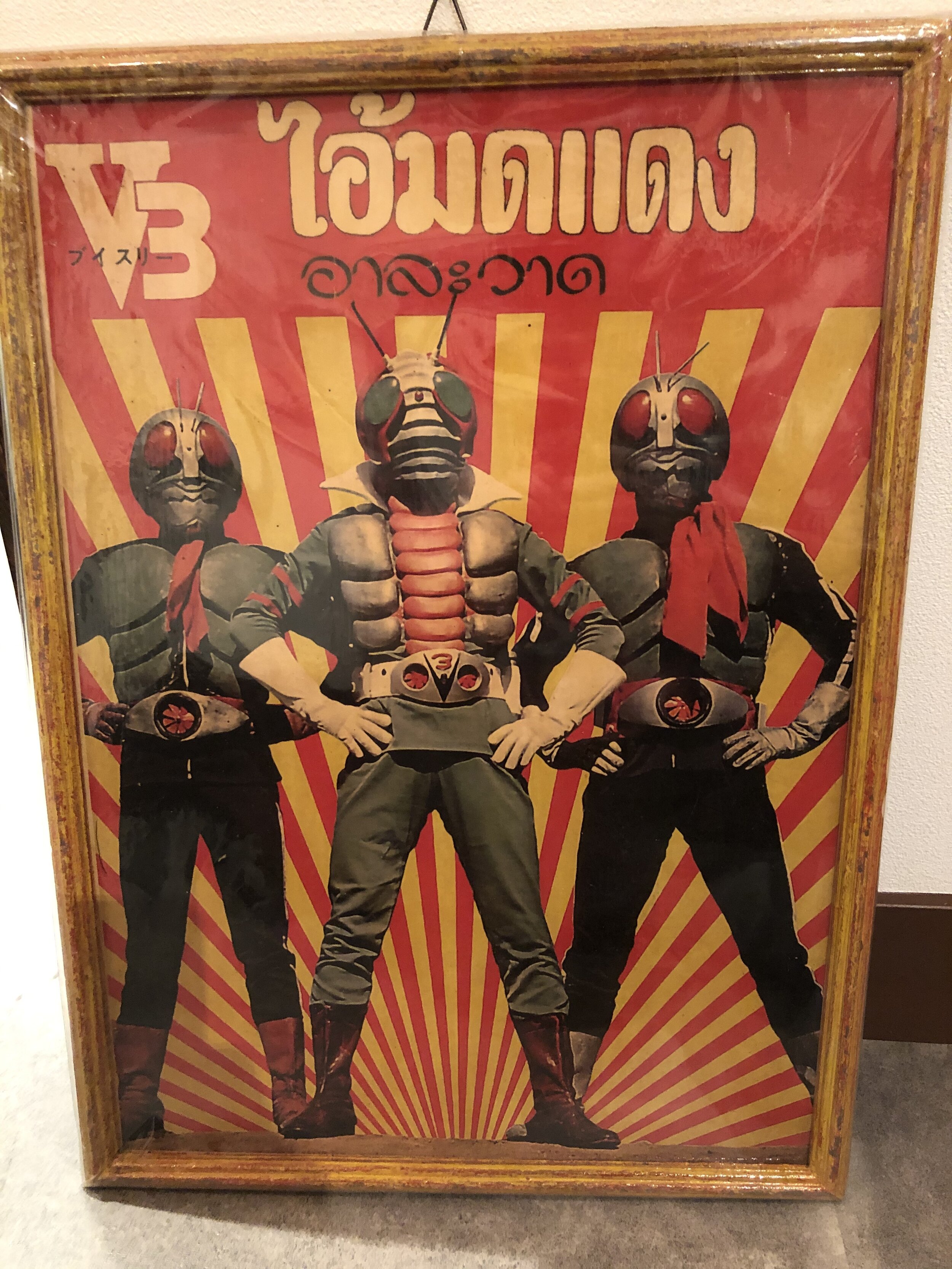
Makoto also suggested I send him photos of my interests so he could get a sense of my preferred tastes. During May, he’d come up with some ideas. Since I had recently been getting these jazz LPs through DeAgostini, and we intended to decorate the BnB with some old posters I’d bought in Thailand, I sent him photos of all that stuff.
I didn’t hear back for some time. I felt rather relieved because I was worried I wouldn’t really like the designs he presented. But since I didn’t know what I was looking for, and since he’d already done the work, I’d just pick something even though I wasn’t feeling it. But then in early June, he was ready, and we had an appointment.
June
When I saw the three proposed logos, I was taken off guard. I anticipated not being able to choose because I wouldn’t like any of them. It turns out, I couldn’t choose because I liked them all. I suppose it’s a good problem to have.
The first logo was a warped pentagon - sort of a house with a good foundation but flimsy walls. KOTO-BUKI-HOUSE was piled up in the center and underneath there was space for a slogan (another area where I’d be completely lost. (“Come and be kotobuki at Kotobuki House.” … I think I can get by without a slogan.) It looked really good stenciled onto concrete and metal, in hallways and stairwells.
The second had a vertical orientation, with the lines in the K and H looking like streets running north south. It looked good super-imposed onto a tote bag and other merchandise. In my opinion, it was the most unorthodox logo of the three.
The third was another house outline, plus the character for kotobuki (寿), made from one continuous line. I think the attraction for this one was, hey, people like kanji.
I really thought I was going to pick one of the first two, not the kanji, until something made me lay the image of the actual building one top of the kanji for Kotobuki.
I thought the layout of the building resembled the kanji for Kotobuki. I’ll try to help you see it the way I see it.
Beek also came up with some other signs for the building and アール ムコやマ (R-Mukoyama) installed them in July.
And that’s where we are now. The BnB is up and running but it’s August and I’m still waiting to fill up that café and shop space.


